Accessibility in GitHawk
Supporting accessibility is one of the most overlooked features in apps. Sometimes the developer forgets accessibility exists, a client doesn’t know about (or cannot quantify) the benefits, or developers simply haven’t had the experience using accessibility features in order to see the impact it has.
Sadly, there is almost always an excuse for not taking the time to get accessibility right.
The Importance of Accessibility
Everyone is different. People use apps - or devices, even - the way that works best for them. That includes people who have difficulty using an app like you. Some people use dynamic type to make text across the whole OS bigger - or smaller. Others want to reduce motion or increase contrast.
If you haven’t tried any of these features before, give them a go and see how the system apps (and Springboard) apply these changes. Then, try some 3rd party apps and see if you can tell the difference (spoiler: you can).
For example, a blind users can browse Photos.app and get a description of a picture or video. In Camera.app, you can get audio feedback of your viewport: how many people are detected, if they’re smiling etc.
Accessibility in GitHawk
GitHawk still has a way to go to make it a truly accessible app, but it already makes an impact by caring - and starting somewhere.
For example, we support VoiceOver features throughout the app. Things like UILabel, UIButton and other APIs support VoiceOver automatically, but UICollectionViewCell does not. This is where you might want to put in effort to create better cells.
We make heavy use of IGListKit which requires we use
UICollectionViewCell.
In GitHawk, a NotificationCell has several labels: the repository title, the issue title, a “time ago” label, and an icon (indicating either a Pull Request or an Issue). These would all be separately accessible, making the app cumbersome and annoying with VoiceOver enabled.
We changed this so the cell is one big accessibility element (with single a button trait). We then used Swift’s compactMap() and reduce() to convert all these labels into one string.
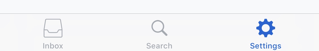
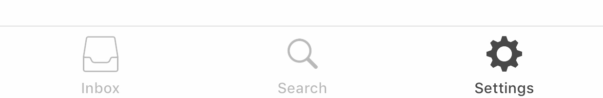
Also - and I feel this is a simple thing to add that all users benefit from - is a selected and non selected state for the tab bar icons. This allows you - and especially colorblind people - to quickly identify which tab you are using.
Implementation
If you want to have some examples of how the accessibility features in GitHawk were implemented, check out #32, #119 and #178.
Want to help and improve the accessibility features in GitHawk? There’s an issue tracking progress: #118.
If you feel like an accessibility feature is missing and has not yet been added to the issue, please feel free to leave a comment there!
Closing Thoughts
Even though not everyone will need or make use of all accessibility features, everyone will benefit from at least some of them. For others, accessibility support can be the difference betweeen using your app in a meaningful way — or not at all.
Please consider looking into the possibilities the accessibility features can offer for your app or product, and keep in mind that there are people greatly benefiting from your effort. From my experience, when you start using those features yourself - to test them, for example - you might even get to love them and start using them.
Making an app fully accessible takes a lot of time and effort, but it’s super easy to start somewhere and go from there.
If you have any other questions about accessibility or want to get started with accessibility in your app, I’d love to help. You can reach out to me on Twitter: @basthomas.
You can download GitHawk on the App Store. This blog post is also available on the GitHawk blog.