Everything is Accessibility
Before we look into how we can approach working on accessibility, I want to look at what constitutes accessibility. And what does not.
The bad thing: that’s not a straightforward question to answer. The good thing: the fact it’s not straightforward to answer is actually a good problem to have.
When thinking of assistive technology like screen readers or braille input and output, I assume it’s straightforward we’re talking about ‘accessibility’.
When we talk about voice assistants like Siri, or dark mode, or haptics (which in SwiftUI are now a broader “sensory feedback” type that extends beyond devices with a haptic engine), or even App Intents that expose app information to the system… are those accessibility?
Some might say yes to all of them, or a hesitant yes. Or perhaps “no” to some. And that’s fair — there’s no right answer here, I believe. But in essence, it does all impact the eventual accessibility of your product for a wide(r) range of users.
Supporting these kinds of functionality makes better products for everyone.
And yes — supporting all of this is a lot of work. But we don’t have to do it all in one go. We can start with dark mode and sensory feedback. Labels and traits to improve the VoiceOver experience. And then we can expand on that in the future to improve the experience for Voice Control users, building on top of the labels and traits we implemented for VoiceOver.
Reasoning about Assistive Technology
“This all sounds great!”, you might think. “But now what?”
I’ve heard this a lot. And it’s a fair question. Especially in accessibility, I’ve come to the realization that part of what makes it difficult to support is that a lot of people don’t have a clear picture of what accessibility entails. Or, said another way, “don’t know what they don’t know”.
This means there’s a barrier to overcome. Let’s look at some ways that make it easier to overcome said barrier.
Navigating by Voice (Voice Control)
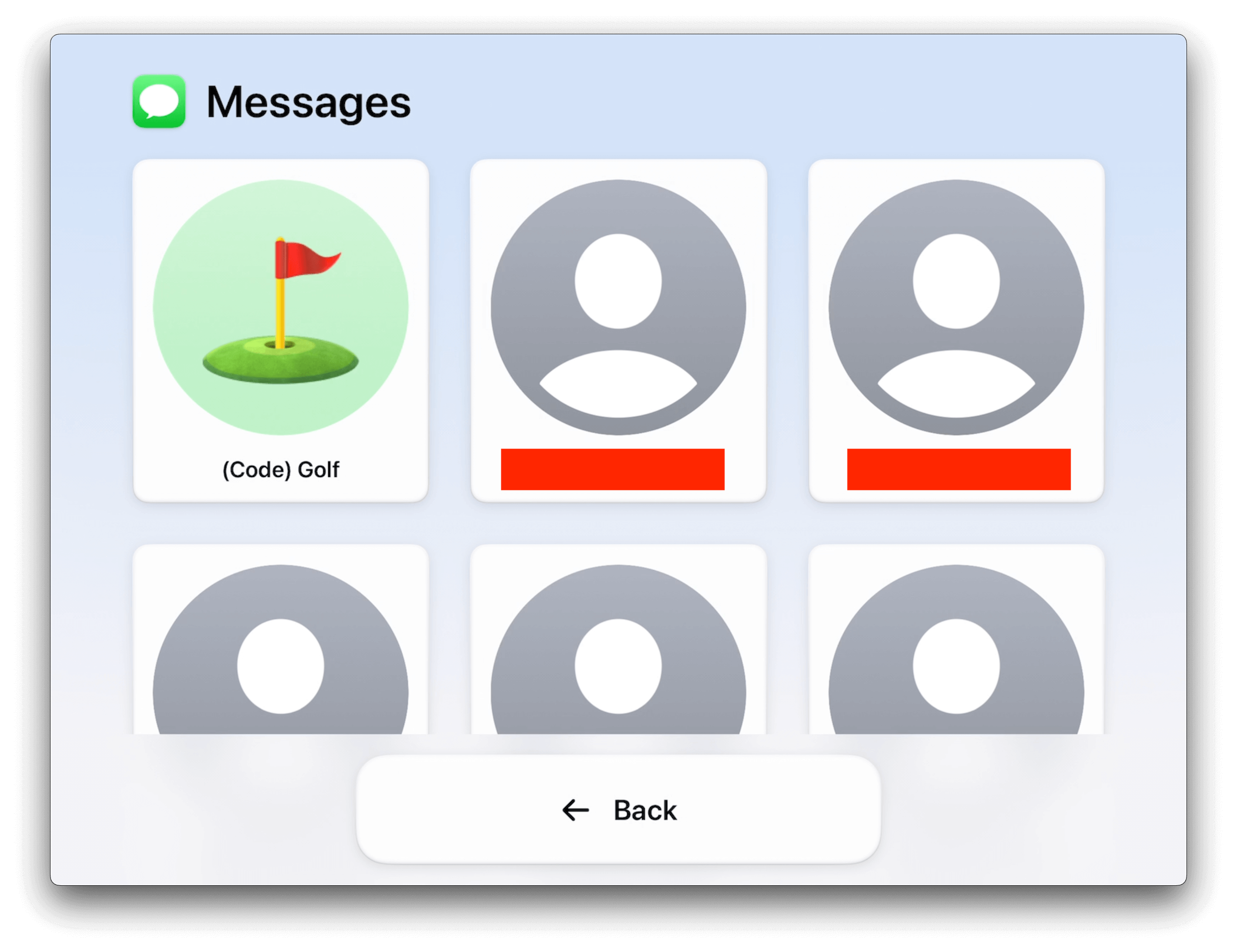
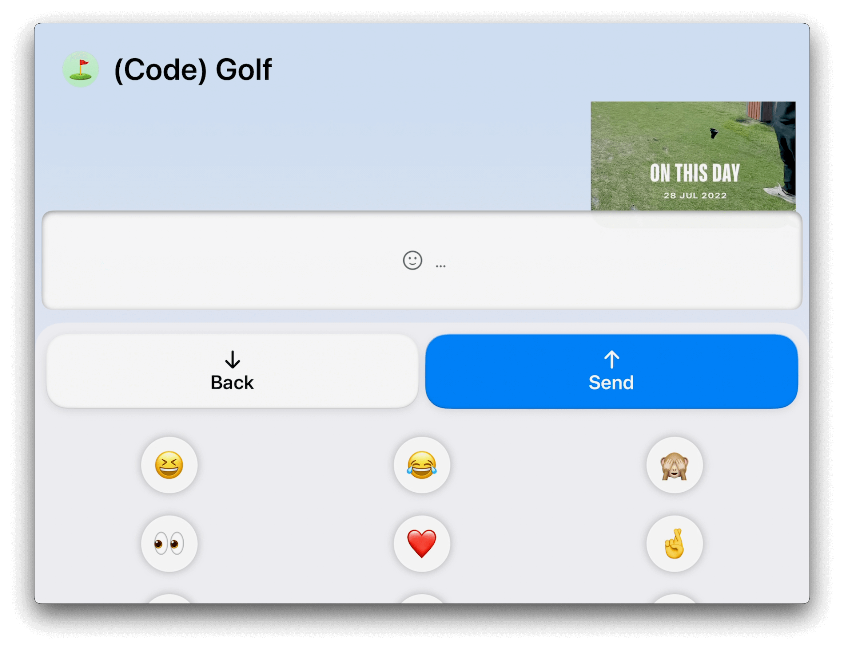
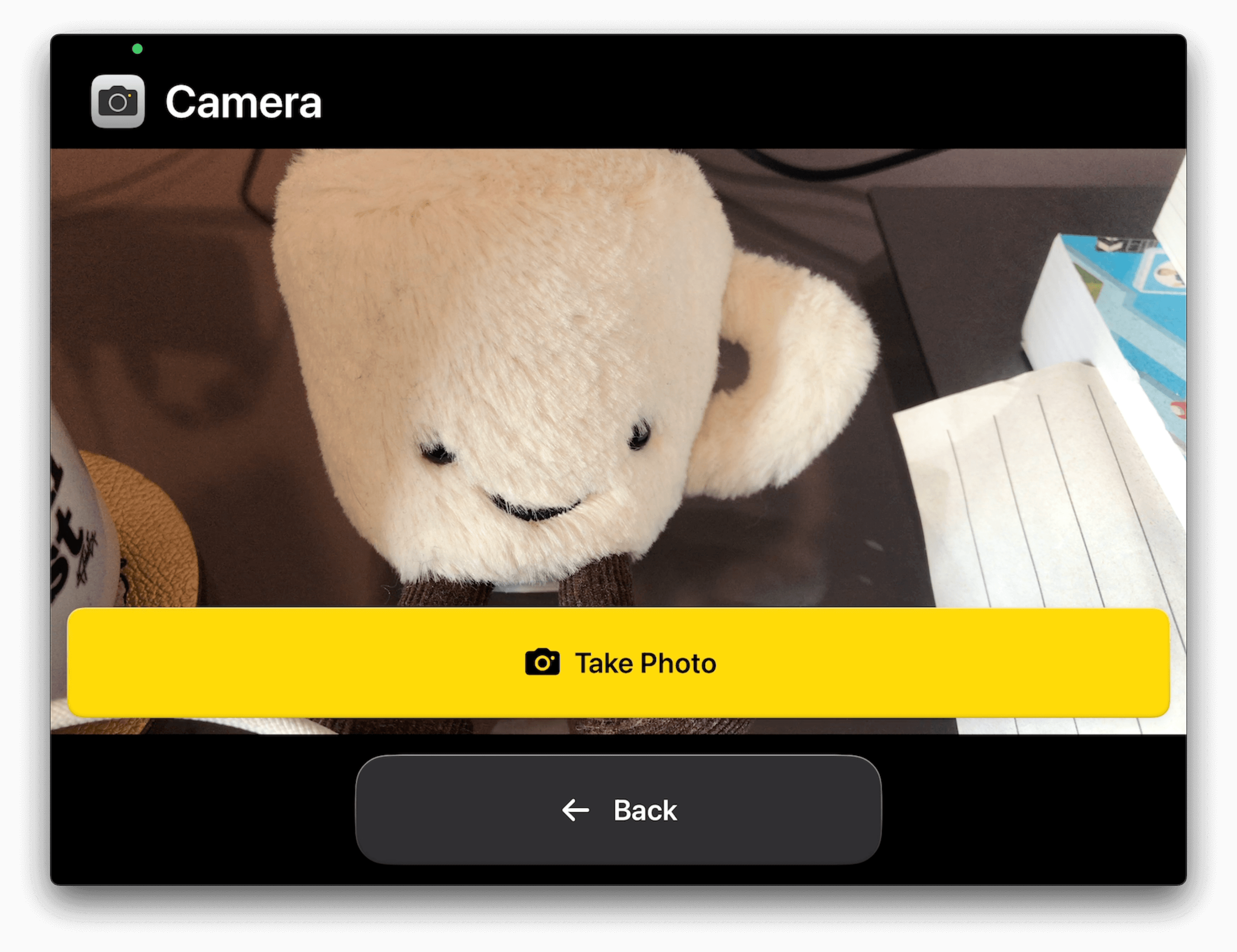
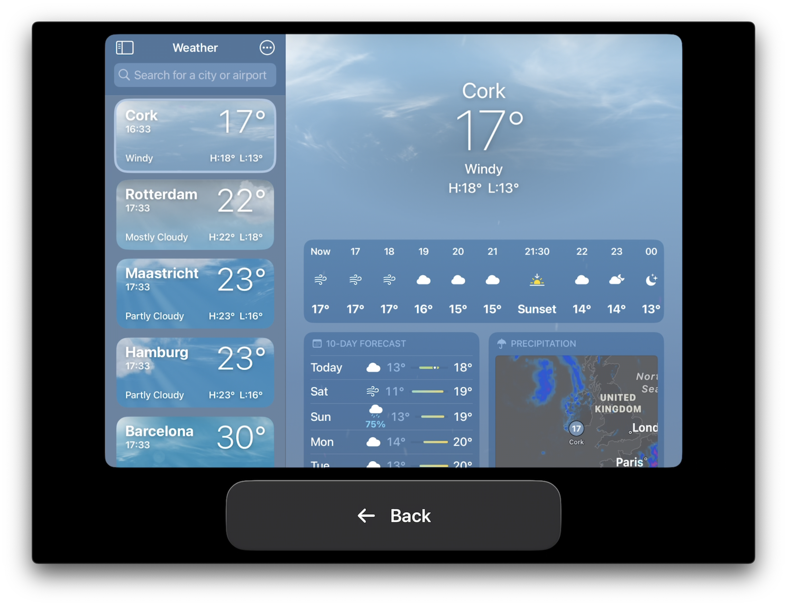
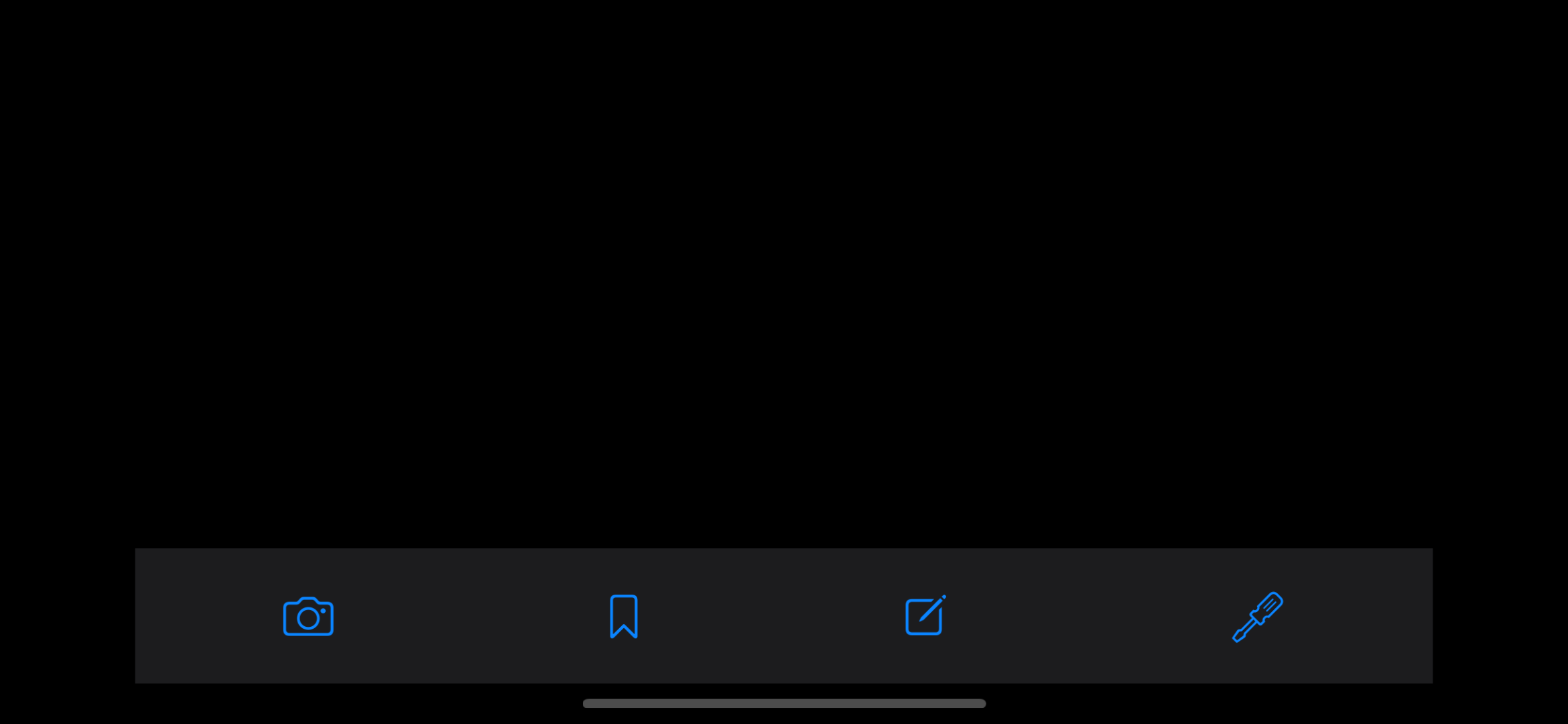
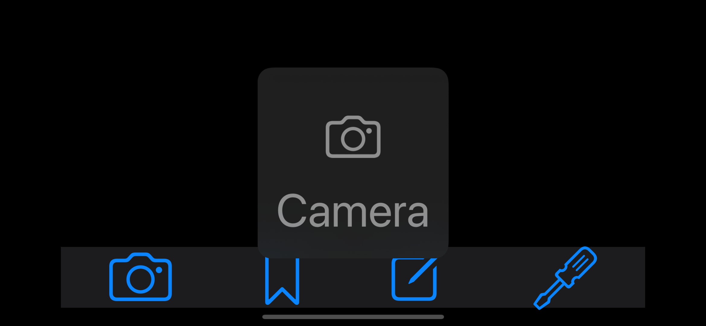
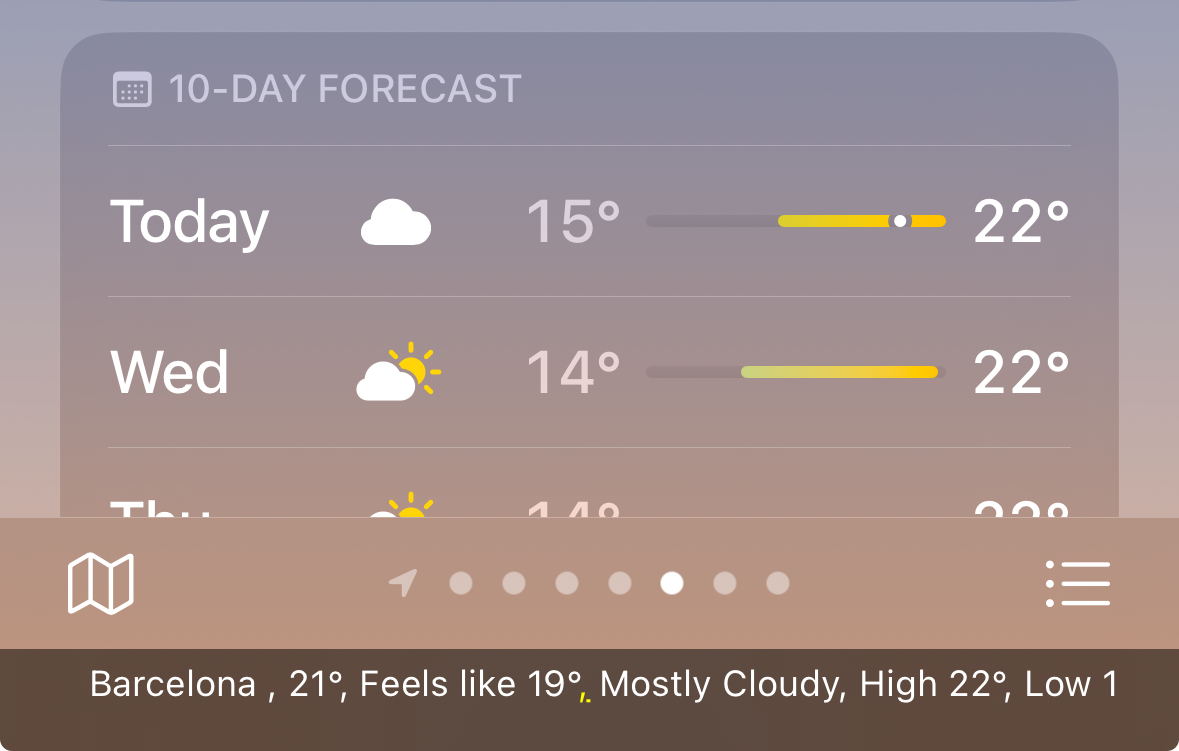
Using Voice Control, we can navigate a device by voice. Users with motor difficulties might rely on this assistive technology, but beyond that — it can help us get a sense of certain1 labels within our product.
Seeing some of these labels might already help us get a first insight into issues. If any of the labels don’t make sense, or would be hard to read out loud, that would be an indication we can improve things.
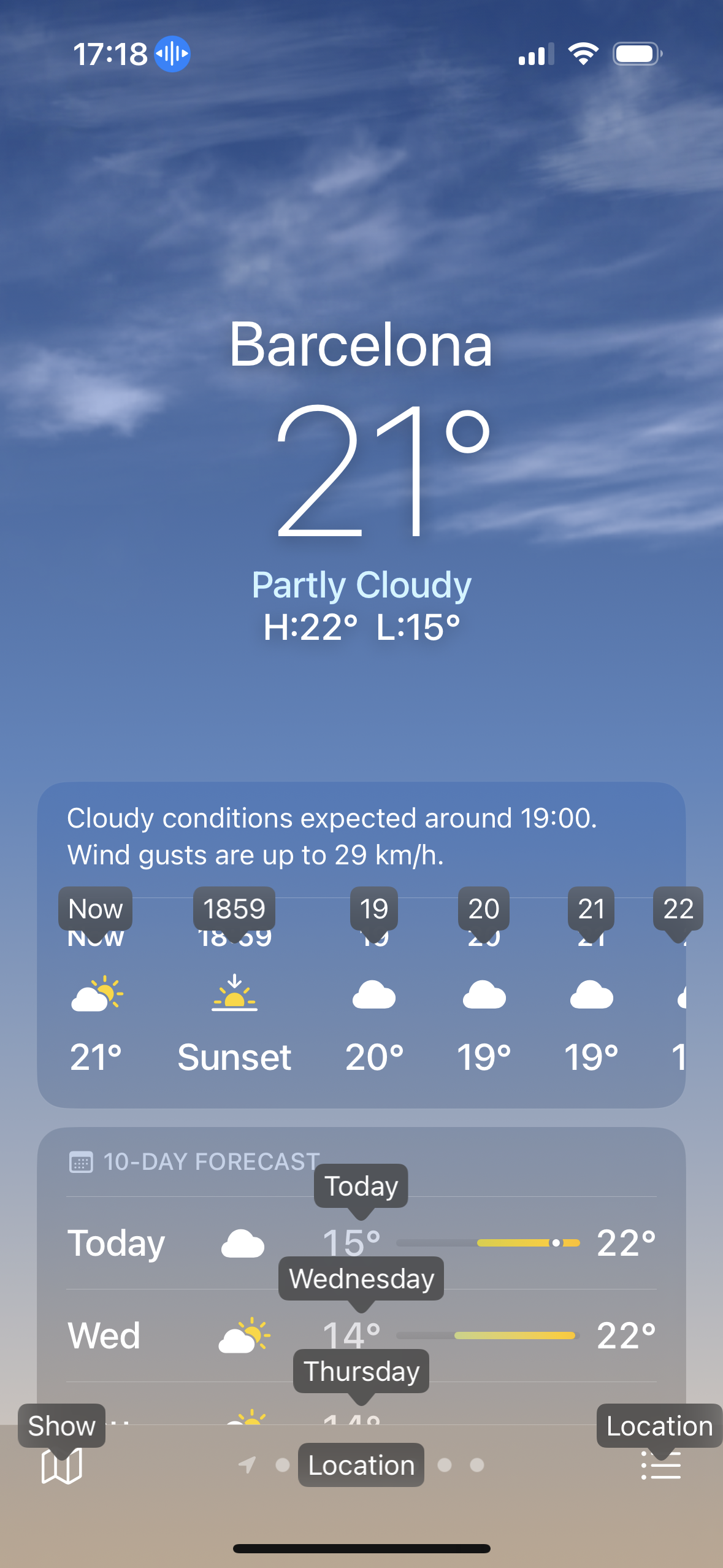
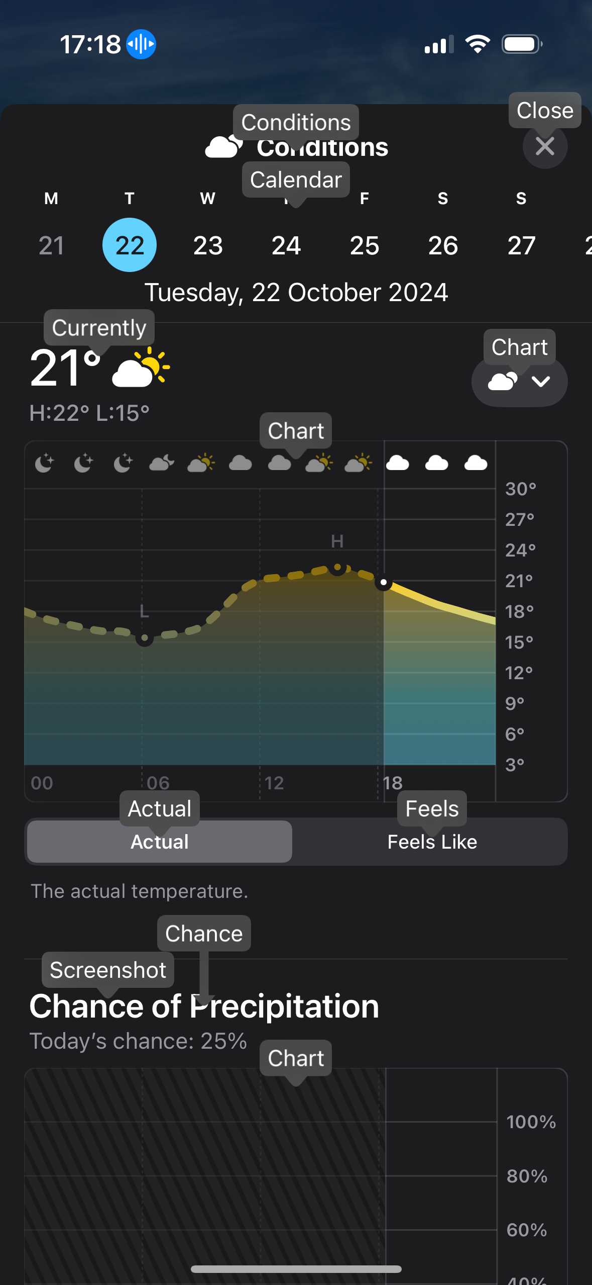
Another thing that’s interesting here is it only showing the first word within a label. For example, in the second image, there’s a “Feels Like” within a segmented control, but its label is shown as “Feels”. This makes it easier to activate an item, but at the same time makes it feel less natural.
Alas, we can see a bunch of labels, giving us a visual overview of accessibility pertaining Voice Control in our app. This includes some unexpected ones that are likely bugs — like the “Currently” label on the current temperature in the detail view. This is not an interactive element, and thus should not be exposed to Voice Control. Similar to “Chart” at the top of the temperature chart, which is also non-interactive.
All in all, it is a great way to get an initial feeling for an assistive technology where navigating is likely to feel quite natural — it does not require learning special gestures, for example.
This document describes how to use Voice Control on iOS.
This document describes how to use Voice Control on macOS.
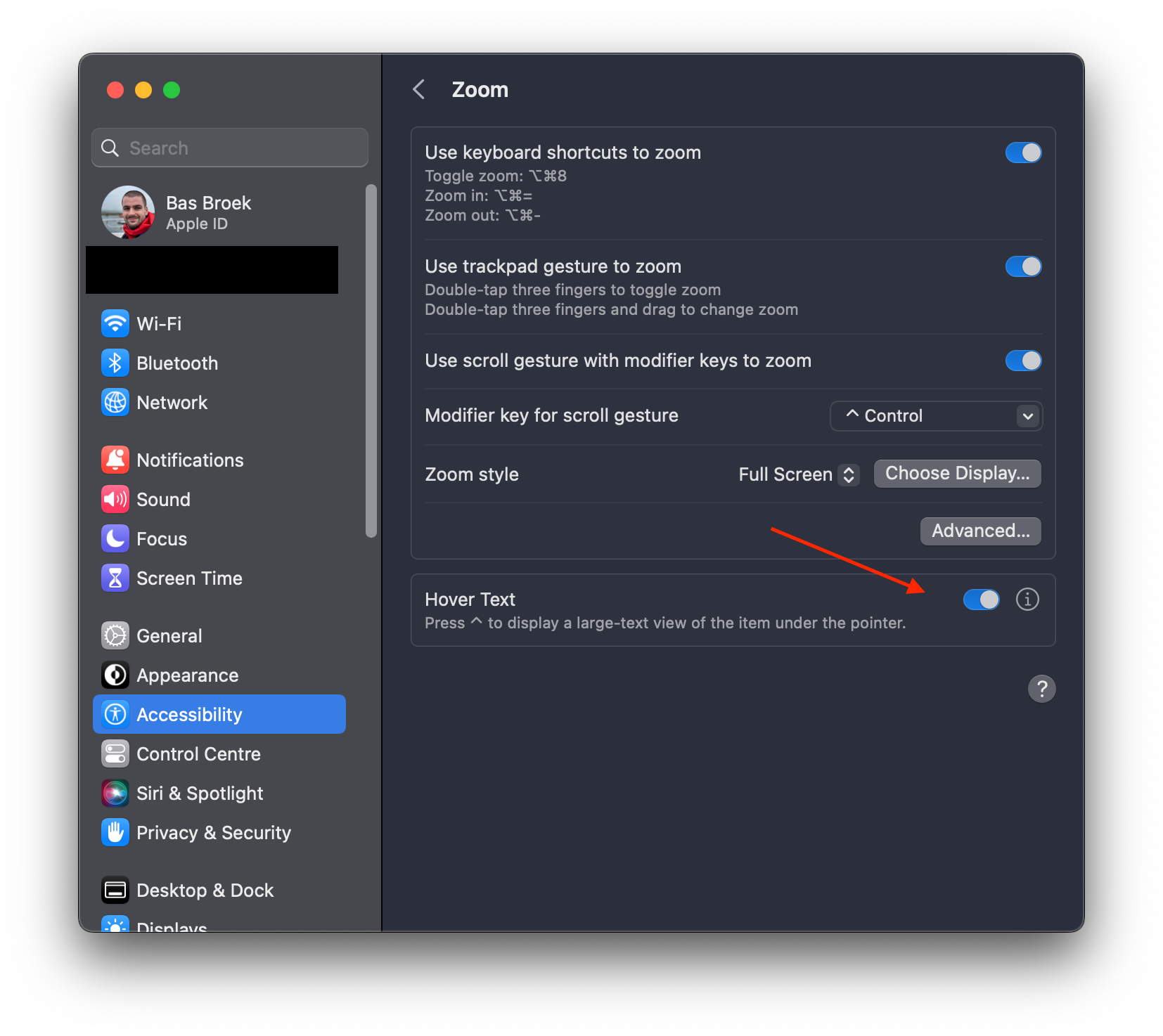
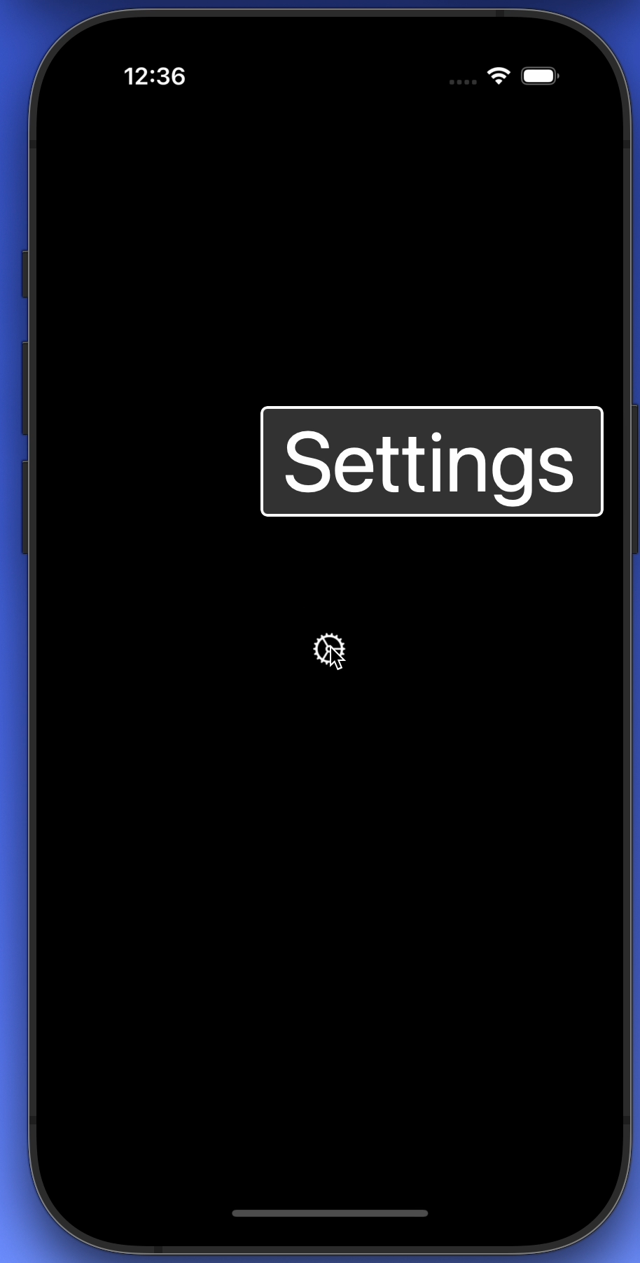
Hover Text (macOS)
Hover Text allows you to show a large window of the selected element — which goes beyond direct text elements.
Not only is this a great non-intrusive way to get a better idea of accessibility, it’ll also come in handy when you’re on a video call and a certain element is quite hard to read for the person on the other end.
So that’s Hover Text. You can quite quickly navigate an application and get an idea of its labels beyond interactive-only elements (like with Voice Control).
The first image showing hover text over a button — with an expected label. The second image showing a… not so great label. Additionally, this can likely be hidden as an accessibility element, as it doesn’t convey information to VoiceOver users — it’s decorative.
You can enable Hover Text on macOS in System Settings > Accessibility > Hover Text. You can change its activation modifier if you wish.
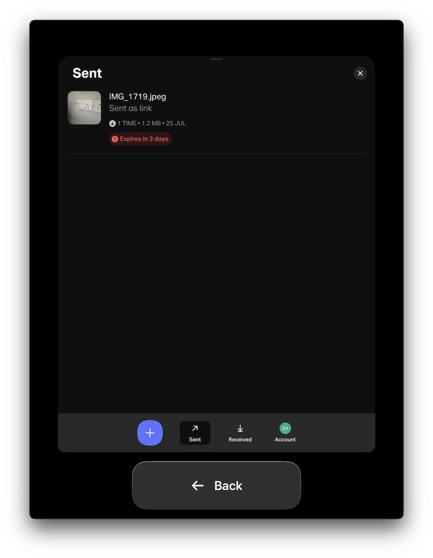
Caption Panel
Using VoiceOver, the caption panel is a neat way to visualize its output. Useful to verify what you think VoiceOver might have said, or if you want to test it without requiring headphones or having the device’s speaker on.
On iOS, turn this on or off from Settings > Accessibility > VoiceOver, where you’ll find a switch near the bottom of the screen.
On macOS, open VoiceOver Utility > Visuals > Show caption panel. Additionally, you can enable the Braille Panel in the same place.
Bonus: Screen Curtain
Alright, this last one might not really be making accessibility more accessible like the others. But it does make accessibility more tangible in the context of a screen reader.
Most users of screen readers are blind users or users with low vision.
For the former group… you don’t actually require the screen to be on. And that’s Screen Curtain. There for three reasons: one is privacy — no screen output means others can’t see what you’re doing. The second is efficiency — no pixels to power and spend battery charge on.
And, third: it’s a great way to “not cheat” whilst using VoiceOver. It’s likely you’ll still use visual cues to navigate the screen using VoiceOver, especially to get out of situations where you feel stuck. But with Screen Curtain, that becomes impossible. A “hardcore” way to understand your app’s accessibility and how to navigate it.
This document describes how to turn Screen Curtain on and off.
Closing Thoughts
Accessibility has a steep learning curve, but I hope these tools give you a better idea where you can start. As well as a way to encourage others to get an introduction to accessibility without having to dive deep into assistive technologies. Let me know how you get on!
-
Voice Control is expected to only show labels (or numbers) for elements that a user can activate. So note that a) labels shown for non-interactive elements suggest an issue to investigate, as well as b) it will not give you a complete picture of all labels present in an app; like a label that describes a non-interactive image (to VoiceOver), which itself is not available within Voice Control. ↩