Building an Accessible Custom Tab Bar
Recently, I’ve been working on making a custom tab bar in our app accessible.
That is, make it work just like a native, out-of-the-box UITabBarController.
Whilst possible, it was far from straightforward. In this post, I want to talk
about matching the built-in behavior, by supporting the Large Content Viewer as
well as the magical (as you will see later) .tabBar trait.
You can find the code from this blog post on GitHub.
Large Content Viewer
To start off, let’s take a look at what our custom tab bar looks like, and how we’ve built it.
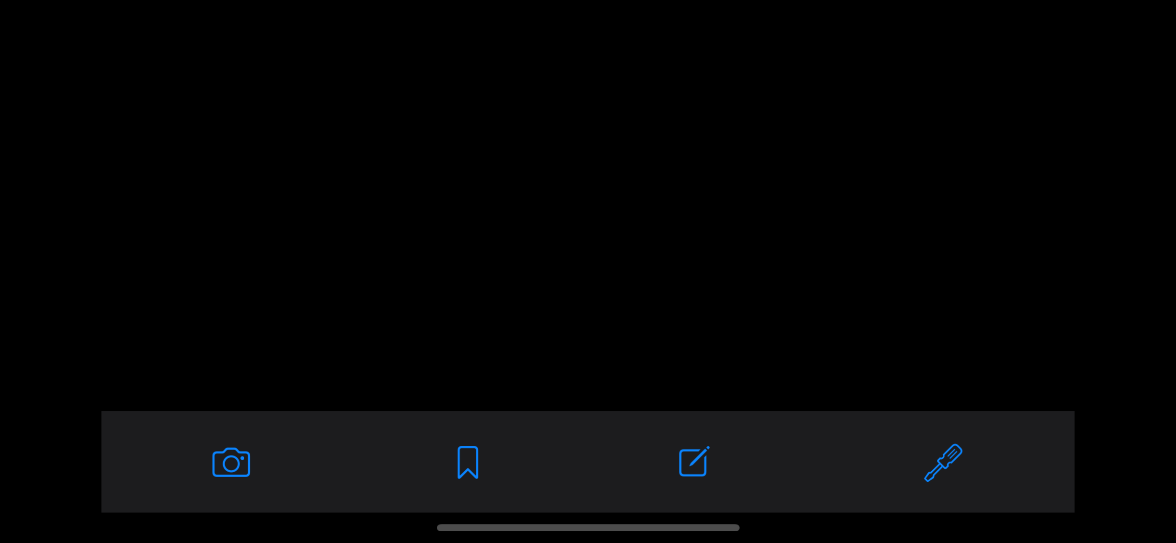
What we’re looking at is a blank, plain UIViewController that contains a
UIStackView. That stack view has four buttons added as arranged subviews.
Grand. So these are buttons, which we can tap and react on. Now, we want to
make sure we can long-press these to show the large content viewer; something
that comes out-of-the-box with UITabBarController. To do so, we first set
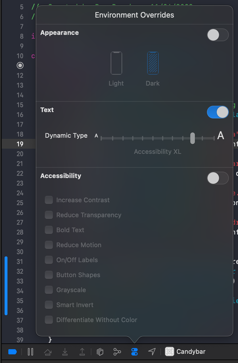
the font size to one of the accessibility sizes; it will not appear otherwise.
To do so, navigate to the debug bar at the top of the debug area in Xcode, activate “Environment Overrides”, enable “Text” and set the Dynamic Type to something in the Accessibility category.
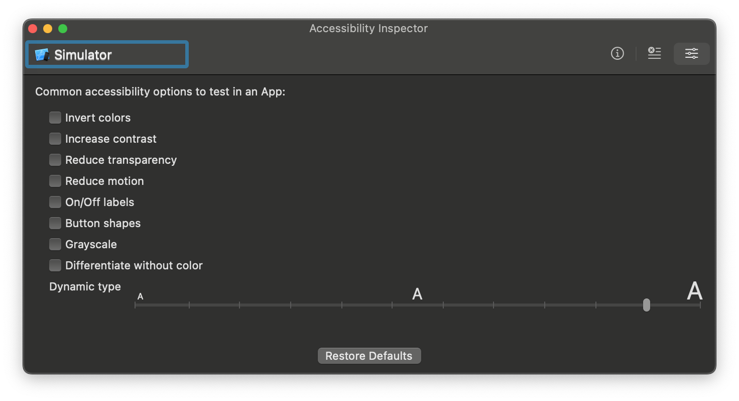
Alternatively, you can do the same in the Accessibility Inspector’s “settings” tab.
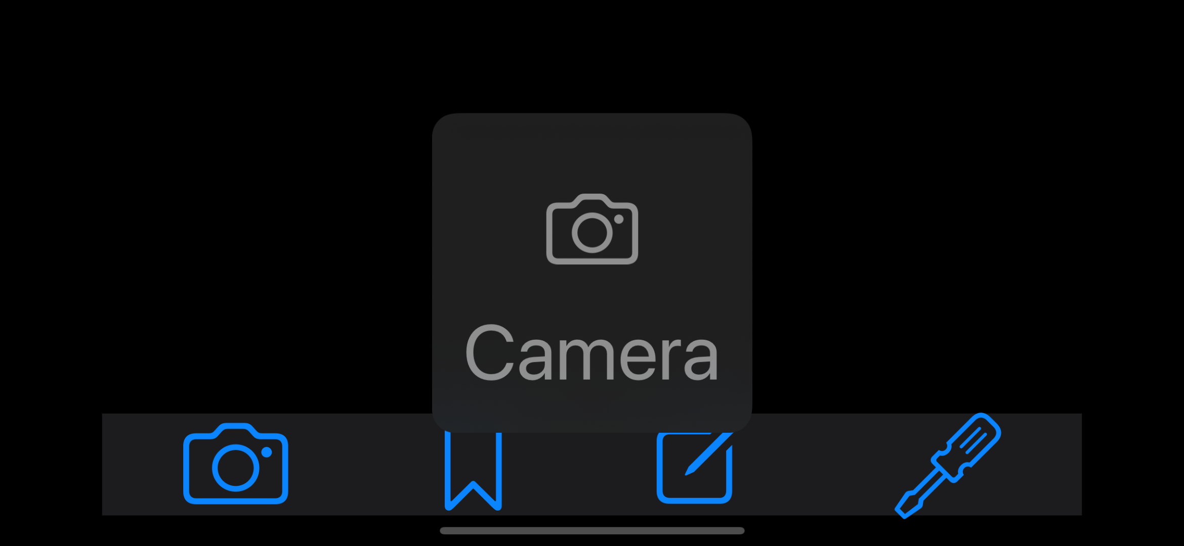
Alright, so… here we go! Long press on a button…
… and observe nothing happens. What gives?
Not All Buttons Are Created Equal
Now, Apple recommends to always prefer elements that can grow to smaller or bigger sizes. In many cases, that’s what you want — and you will not need to add support for the large content viewer, as the elements themselves grow.
But as you can imagine, this becomes tricky in certain scenarios, and a tab bar is one of them. Growing the tab bar means we’re taking up more and more screen real estate, meaning we have less space to show the rest of our app.
Hence why we want to support the Large Content Viewer for these buttons in our case.
To do so, we use the showsLargeContentViewer API that is available on
UIView.
button.showsLargeContentViewer = true
Alternatively, we can also set a largeContentTitle to go alongside the viewer,
indicating the title of our tab/button.
button.largeContentTitle = NSLocalizedString(
    "Camera",
    comment: "The title describing the `Camera` tab."
)
Build and run the app and…
Oh no, it still does not work?!
Documentation to the Rescue, Kind of
showsLargeContentViewer’s documentation mentions:
For this property to take effect, the view must have a
UILargeContentViewerInteraction.
… yet neither largeContentTitle nor largeContentImage’s
documentation do. OK, so let’s add the interaction:
bar.addInteraction(UILargeContentViewerInteraction())
Tada!
One More Thing…
Now, there’s one more thing we can do to improve this. The largeContentImage
is picked up by the UIButton’s image, but it may not really grow to take up
the space in the large content viewer. Even though that’s quite a big part of
why we have this in the first place. Make sure that if you need this and enable
it, you may want to “preserve vector data” so that the image doesn’t get blurry
when scaled up.
button.scalesLargeContentImage = true
All of the above is also neatly summed up and touched upon by Sommer Panage in the WWDC video Large Content Viewer - Ensuring Readability for Everyone.
The Tab Bar Trait
The other part of making a custom tab bar accessible, is making sure it is seen as a tab bar by assistive technologies like VoiceOver. If you’re unsure what that feels like, try out a standard tab bar in an app by navigating through it with VoiceOver; it’ll add a bunch of great information, like which tab you’re on, and that we’re dealing with a tab bar in the first place — as well as making a container element for it so it’s easier to navigate to.
Whilst in theory this seemed straightforward in my head — add a trait to those buttons — it wasn’t as easy as I’d hoped.
First of all, you don’t add a trait to the buttons themselves; instead you add a trait to the parent view — the “tab bar” if you wish. Which feels… weird. It’s certainly not something common in terms of assigning traits.
Anyway. So the documentation further mentions that
If an accessibility element has this trait, return
falseforisAccessibilityElement.
When I read this, on top of the unusual way of adding a trait to the parent view, a visualization of my brain would’ve been this:
Anyhow, I tried doing what the documentation said:
tabBar.accessibilityTraits.insert(.tabBar)
tabBar.isAccessibilityElement = false
… and ran the app.
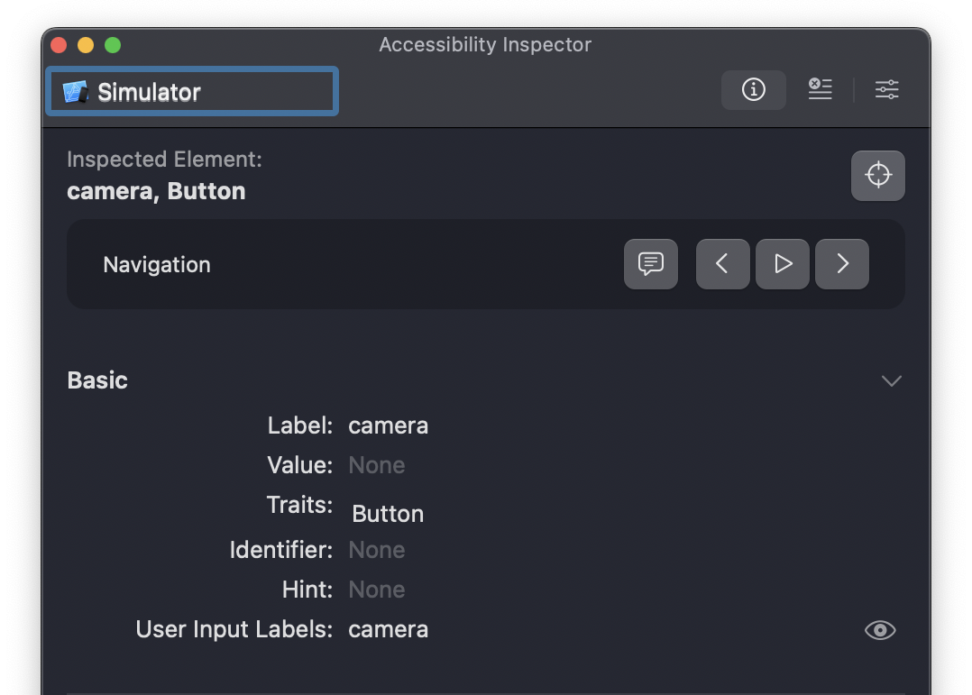
Womp womp. Nothing tab bar related, even though that is what we’d expect given the documentation. Even the spoken output that is supposed to mimic VoiceOver just speaks “Camera, button”.
So, this was not… completely unexpected? I was (still) confused about how
this was supposed to work in the first place. Or as I described it in the pull
request once I Sommer finally found out what
was going on:
The documentation says that this is how you set up a custom tab bar. You set the parent element to have the
.tabBartrait, and then you setisAccessibilityElementon said parent to false. Which makes like, zero sense. The API “contract” is to not listen to anything that hasisAccessibilityElement = falsein terms of accessibility. Yet here it does mean something and has a side effect.But so apart from that, things still did not seem to work. Which was like half expected, as per what I just noted. The inspector says “no bueno”, not adding the internal “tab” trait. So no idea how to debug this or look into it.
Turns out, it does actually work… only on device. Even if inspecting the device with Accessibility Inspector, it’ll still pretend that things don’t work (read: no tab trait), yet VoiceOver reads everything correctly.
sigh time to write a blog post and file a bunch of radars on this.
… seems like it all “worked” after all. Thanks (again) to Sommer (and someone at Apple) for helping me stay sane here.
Now the only thing you’d have left to do is to insert or remove the .selected
trait of the “active” tab bar item.
Conclusion
Phew. Though there are a bunch of gotchas when it comes to making a custom tab bar accessible, it is certainly possible. The good thing is that it all works for the end user. The not so great thing is that implementing it isn’t straightforward, and the usual tools like the Accessibility Inspector will give you wrong information.
Hopefully this post has been helpful if you have a custom tab bar in your app that you want to make accessible!
Let me know your thoughts on this post, and if you have any questions, I’d love to help!
You can find the code from this blog post on GitHub.